Typography

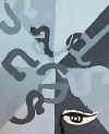
Our first painting followed an achromatic scheme: all grays. Several standards were achieved including specific design principals like  variety, contrast, balance, and emphasis. Typography in art was introduced with several famous artists serving as sources for inspiration: Stuart Davis, Robert Indiana, and Charles Demuth.

The goal here was to design original letters that spelled out a one-word concept. Students then had to illustrate an image that symbolized their concept choice. The entire picture was painted in a variety of grays while the image (a focal point) was shown in either black, white or a combination.

type1.jpg (29307 bytes)

Rachel T.

type2.jpg (25194 bytes)

Emily E.

type3.jpg (23582 bytes)

Kristen K.

type4.jpg (25433 bytes)

Dylan K.R.

type17.jpg (25751 bytes)

Lora B.

type5.jpg (21617 bytes)

Greg K.

type6.jpg (22233 bytes)

Justin H.

type11.jpg (22983 bytes)

Rebecca M.

type7.jpg (28936 bytes)

Scott L.

type8.jpg (22730 bytes)

Molly S.

type9.jpg (26005 bytes)

Gabi L.

type14.jpg (23091 bytes)

Sean P.


type12.jpg (23596 bytes)

Anthony G.

type10.jpg (18710 bytes)

Carri W.


type18.jpg (26654 bytes)

Nisha C

type13.jpg (24984 bytes)

Rachel B.


type15.jpg (20208 bytes)

Jason C.


  type16.jpg (26144 bytes)

Taylor C.

type19.jpg (23848 bytes)

Lacy G